

Showing posts with label styling. Show all posts
Showing posts with label styling. Show all posts
February 15, 2019
Accessory Shopping with McGee & Co
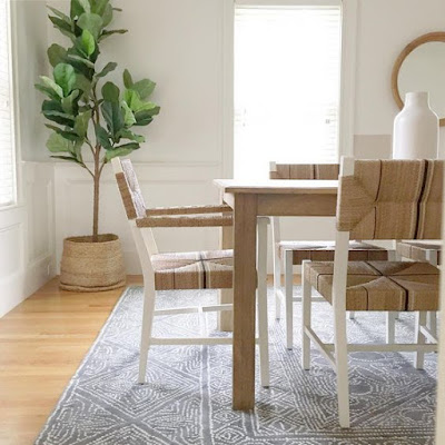
reviving the good old blog today! mcgee & co asked if I wanted to partner with them on their president's day sale and I thought about it and said no thanks. PSYCH of course I said yes! they kindly gave me a little spending money to purchase some items so I chose to focus on accessories (check out my IG stories to see what I got!). styling is such an important part of finishing a space. I can design a room and get all of the furniture in place but without the last layer, it will still feel unfinished. sometimes it's hard to go for that final bit on a project when you've already spent a lot but it's worth it!!! all links below 👇

October 8, 2018
Fresh Styling with Brooke & Lou!
my friend bria hammel of bria hammel interiors started a new line of furniture, accessories, pillows, artwork, and wallpaper called brooke & lou after her two kiddos! when she asked me if i wanted to join her in supporting the launch of the brand, it took me maybe .5 seconds to say yes. i love seeing other woman succeed and it is so empowering to watch (and even help!) someone grow.

as soon as i saw the email, i knew exactly which pieces i wanted to use and where i wanted to put them. the new build i had worked on over the summer has this great built in nook upstairs with two bookcases and a bench seat. it was still empty! i chose the between the lines artwork in pink in the 30x40 size as well as two 20" pillows in lyla stripe in blue. the photo online does not do this fabric justice. it's so pretty!!

i paired the two lyla pillows with a bungalo lumbar pillow that i already had and the colors worked really well with the artwork. the art was all created by artist abbey holden and framed in a soft gold frame. it comes in a bunch of other colors too!

that took care of the bench seat and the wall but the bookcases needed some major accessorizing. i shopped at west elm and target (it doesn't need to be fancy!) to make the shelves come to life. i wanted the overall feel to be fresh, light, and feminine.


styling isn't a perfect science - at least for me! but there are some tricks i use to get it just right.
1. lay everything out in one spot so you can see everything you have to work with.
2. work with odd numbers. stacks of books, vases, or even just one larger item feel better when there is 1, 3, or 5.
3. pay attention to height of the items and vary it left to right and up and down. for example, three times i used one accessory by itself but i made sure not to place them both on the highest shelves, especially since they weren't a pair.
4. find a color palette and stick to it. here i did a lot of pastels but also included some darker accessories to ground everything.
5. proof of life (to steal a phrase from alyssa rosenheck!). greenery is a must and always makes whatever you're looking at feel alive - pun intended ;)

i always tweak and tweak some more. it's never right the first time! what other tips do you have for styling a space? thank you to bria for the beautiful art and pillows and to my client for letting me invade her space!
ACCESSORIES LIST
left bookcase, top to bottom: cement box | marble planter | white round vase (homegoods)
right bookcase, top to bottom: plaid vase | rattan basket | white dipped vase | blue marble planter |
March 2, 2018
Accessories!
happy friday friends! i've been scooping up accessories for clients lately and it got me thinking about how many accessories it take to style a house or even just a room. houses devour accessories. it's very easy to underestimate the amount of "stuff' you need to really so i rounded up a whole ton of great items for any home that are all fairly well priced!
but first some inspo!


everything here (except the bedding) is under $40!!

everything here is under $90!

but first some inspo!


everything here (except the bedding) is under $40!!

everything here is under $90!

always add books too - click here for a round up of great books to style spaces!
November 27, 2017
Thanksgiving Table
hey y'all! i hope everyone had a wonderful thanksgiving and enjoyed a break from work or just even the routine over the last few days. i know i did! so did anyone make any fun black friday/cyber monday/general sale purchases?! (btw i find all of these names of these sales SO annoying - just say it's a sale, tell me how much off, and when it starts and ends. done!) i made one fun house purchase that i'm excited about and can't wait to show.
our thanksgiving started with our microwave completely biting the dust after only two years which is infuriating!! so we found ourselves at best buy picking up a new one wedneday night. i have to say the only saving grace is that this happened during all of these sales! the other very unfortunate thing that happened is that i somehow lost my new lululemon rain jacket. i actually must have lost it about a week before but just realized it over thanksgiving. real tears were shed and i'm still hoping it will turn up. 😩 apart from all of that nonsense we had a very nice, quiet thanksgiving with my parents and we were grateful that they came to us this year. anyway! here is our table and for all of the details (i mean every last one, i've linked them all), scroll to the end.
the design of this table was based on green, black, and white palette and the key was layering. the thing i'm probably most proud of is that there is nothing in the decorative items that's over $100 and most are under $50.

i talked about this runner on my stories - it's from a company called small gunns. this is actually two 60" runners overlapped in the middle. the thin black and white stripe was exactly what i was looking for.

i layered rattan chargers, black plates, white linen napkins, and mini cheese boards that i wrapped with a piece of ribbon and topped with a sprig of rosemary.

i used a ton of eucalyptus - both the garland and the vases had fresh cut seeded eucalyptus. i'm not great at arranging flowers and the eucalyptus is easy! the garland i shipped in but the stems in the vases were from whole foods! i added a couple of white peonies to each to break up all of the green from the vase and the leaves.

my dining room definitely has a beachy vibe and to make it feel cohesive with the table, i carried the green, white, and black over to the cabinet. but i still kept the accessories fairly beachy using beads and natural materials.

since there were only six of us, i took advantage by styling the ends of the table where no one was going to sit. it made it feel more lived in and relaxed.

truth be told, i can't stand this chandelier in here. i ordered it a while ago thinking it would work but in reality it doesn't work at all. i have a replacement ordered but it didn't come in time for thanksgiving. this one could be so good in another space and it's officially for sale!


ready to shop the look? i've rounded up all of the EXACT pieces from my table. not "close alternatives" but the same things i used. and the best news of all is that many of these items are on sale!

not pictured but you can find the chandelier here: http://bit.ly/2AaSfS8 i'm sure i've forgotten something so feel free to ask! the table is no longer available and is from restoration hardware.
on a completely unrelated note (that you may have seen on my stories), my two little guys got to skate at the boston garden during a bruins game last friday!! it was such a great time and i am just so proud of those two. i hope they always remember at least some of day and if not we have about 40 videos to show them. 😉

our thanksgiving started with our microwave completely biting the dust after only two years which is infuriating!! so we found ourselves at best buy picking up a new one wedneday night. i have to say the only saving grace is that this happened during all of these sales! the other very unfortunate thing that happened is that i somehow lost my new lululemon rain jacket. i actually must have lost it about a week before but just realized it over thanksgiving. real tears were shed and i'm still hoping it will turn up. 😩 apart from all of that nonsense we had a very nice, quiet thanksgiving with my parents and we were grateful that they came to us this year. anyway! here is our table and for all of the details (i mean every last one, i've linked them all), scroll to the end.
the design of this table was based on green, black, and white palette and the key was layering. the thing i'm probably most proud of is that there is nothing in the decorative items that's over $100 and most are under $50.

i talked about this runner on my stories - it's from a company called small gunns. this is actually two 60" runners overlapped in the middle. the thin black and white stripe was exactly what i was looking for.

i layered rattan chargers, black plates, white linen napkins, and mini cheese boards that i wrapped with a piece of ribbon and topped with a sprig of rosemary.

i used a ton of eucalyptus - both the garland and the vases had fresh cut seeded eucalyptus. i'm not great at arranging flowers and the eucalyptus is easy! the garland i shipped in but the stems in the vases were from whole foods! i added a couple of white peonies to each to break up all of the green from the vase and the leaves.

my dining room definitely has a beachy vibe and to make it feel cohesive with the table, i carried the green, white, and black over to the cabinet. but i still kept the accessories fairly beachy using beads and natural materials.

since there were only six of us, i took advantage by styling the ends of the table where no one was going to sit. it made it feel more lived in and relaxed.

truth be told, i can't stand this chandelier in here. i ordered it a while ago thinking it would work but in reality it doesn't work at all. i have a replacement ordered but it didn't come in time for thanksgiving. this one could be so good in another space and it's officially for sale!


ready to shop the look? i've rounded up all of the EXACT pieces from my table. not "close alternatives" but the same things i used. and the best news of all is that many of these items are on sale!

tall green vase | white vase | green beads | wood bowl | napkin | cutting board | coasters | decanter
not pictured but you can find the chandelier here: http://bit.ly/2AaSfS8 i'm sure i've forgotten something so feel free to ask! the table is no longer available and is from restoration hardware.
on a completely unrelated note (that you may have seen on my stories), my two little guys got to skate at the boston garden during a bruins game last friday!! it was such a great time and i am just so proud of those two. i hope they always remember at least some of day and if not we have about 40 videos to show them. 😉

November 21, 2017
Thanksgiving Table
helloooo! i have thanksgiving tables on the brain for obvious reasons. truth be told there are a lot of tacky table settings out there but i gathered up a few that are simple and elegant and provide some great inspo!
if this doesn't make you want to move to california, i don't know what does.

love the little succulent and the ragged edge menu.

i posted this on my instagram but it deserves another look!

the candlelight here really steals the show.

if you don't live in a cold climate, this seems lovely. otherwise, fairly hellish!

i just love the color of these skinny candles, especially with those centerpieces.

perfectly simple. this palette of green, white, and black most closely matches what i have planned!

are you hosting? what are your plans for your table?!
if this doesn't make you want to move to california, i don't know what does.

andee layne
love the little succulent and the ragged edge menu.

lark and linen
i posted this on my instagram but it deserves another look!
@casadeperrin
the candlelight here really steals the show.
via lonny mag
if you don't live in a cold climate, this seems lovely. otherwise, fairly hellish!

via domino
i just love the color of these skinny candles, especially with those centerpieces.

via domino
perfectly simple. this palette of green, white, and black most closely matches what i have planned!

@edbdesigns
are you hosting? what are your plans for your table?!
October 30, 2017
Kitchen Styling
happy halloween friends! everyone ready for that crazy sugar high?! 😉 i’m going to have one Spider-Man and one Batman this year which doesn’t exactly excite me. woes of a boy mom. this is all subject to change of course because not too long ago we had one policeman and one hockey player!
last week i helped a client style her kitchen for a photo shoot that a friend of hers, grey from @ashgreyproperties, was doing as part of a home tour series that she started. you may have seen some videos on my insta stories last friday. grey is a realtor and real estate marketing expert and looks for pretty homes to shoot to share on her website. my client brought me in to style the space for the photos. so while i was there i took some of my own because who doesn't like seeing a pretty kitchen! (scroll to the bottom to shop the post)

*just to be clear - i had nothing to do with the design of the kitchen. i came into the picture after the house was completed to work on other spaces.* the kitchen is gorgeous though and photographs beautifully. it does come off a little cold so my main goal with the styling was to warm it up! i brought a ton of accessories and probably should have brought even more. it’s always amazing how spaces gobble up accessories. the biggest change i made was the counter stools. again to bring in warmth, i ended up lugging my leather stools from home! 😂 it made a huge difference (the other stools were acrylic and chrome and added to the cold feeling). another change we made was the runner and actually this one is a permanent change. i wanted to bring in more texture and a jute rug always does a good job of that.

simple greenery and a farmhouse bowl do the trick every time.


there is also a great desk space/command center and i layered in some of erin clark's art with some wood and ceramics to keep it fresh.


i love how simple this space is yet interesting and with the bit of blue, everything works together so well. now let's get to the good stuff...sources!
counters: london sky by zodiaq
cabinetry color: these were colors from the cabinet maker and not specified to match a paint color
floors: dark walnut stain
art: erin clark
stools | runner | pendants | island vase (small, bottle) | island bowl (similar) | wood bowl next to range canisters | long cutting board | round cutting board | faux rosemary | wood and marble cutting board
August 16, 2017
Coffee Table Book Round Up
i want to say thank you again for the love on the blank slate living room project i shared on monday. i really appreciate it! i've been doing a bunch of photo shoots recently and i'm always lugging books around to style my shots. even when i think i have enough, i don't! so here are 20 (!) of my favorites.


oops plus one more! can't forget mr. berkus. find it here.

March 13, 2017
Faux Greenery
there's no denying how much adding some greenery can help with an overall design. any of these photos i took of my home without the green would be pretty boring. 😴


but keeping up with all of those plants can be tricky. plus not every climate works with greenery all year round. i know some people gag when they hear "fake plants" but personally i'm sure glad they exist. and luckily some of my favorite stores have really put effort into creating some awesome options. no more does faux mean ugly. can you tell they're not real? well yes. but it's not an offensive copy!
so i took a moment to collect a bunch of the trees, branches, and little pots i turn to when sourcing faux greens.

the little guys:
the fiddle leaf figs:
the branches:
the cacti:
October 10, 2016
Lamps As A Styling Tool
we are on day four of an extra long weekend and i am ready for school to be back!! anyone feeling the same? i get to go check in on a project i've been working on and i'm excited to see the space again! today though i want to talk about lighting.
obviously at a very basic level, a lamp is meant to be used to provide light in a dark space. but would you call me crazy if sometimes i were to say to put a lamp somewhere that there isn't a plug? or maybe even a sconce on a wall where there isn't any electrical! lighting is functional but also such an amazing styling tool. i've thought about using this idea at our desk in our office. i also recently suggested adding a lamp to a console in a client's home and her home is an older one where outlets aren't necessarily placed where they would be in a newer home.
some examples... but let me preface them by saying i'm NOT implying that these are all examples of using a lamp only for styling purposes. they might be but i really don't know! what i AM saying is that they are is well-styled spaces and one of the reasons is the lighting!


so are you convinced or am i a nut job?! :)
obviously at a very basic level, a lamp is meant to be used to provide light in a dark space. but would you call me crazy if sometimes i were to say to put a lamp somewhere that there isn't a plug? or maybe even a sconce on a wall where there isn't any electrical! lighting is functional but also such an amazing styling tool. i've thought about using this idea at our desk in our office. i also recently suggested adding a lamp to a console in a client's home and her home is an older one where outlets aren't necessarily placed where they would be in a newer home.
some examples... but let me preface them by saying i'm NOT implying that these are all examples of using a lamp only for styling purposes. they might be but i really don't know! what i AM saying is that they are is well-styled spaces and one of the reasons is the lighting!

lexi westergard design
park and oak design

sarah sherman samuel

waiting on martha

brian paquette via mydomaine

restoration hardware
house beautiful
so are you convinced or am i a nut job?! :)
Subscribe to:
Posts (Atom)


