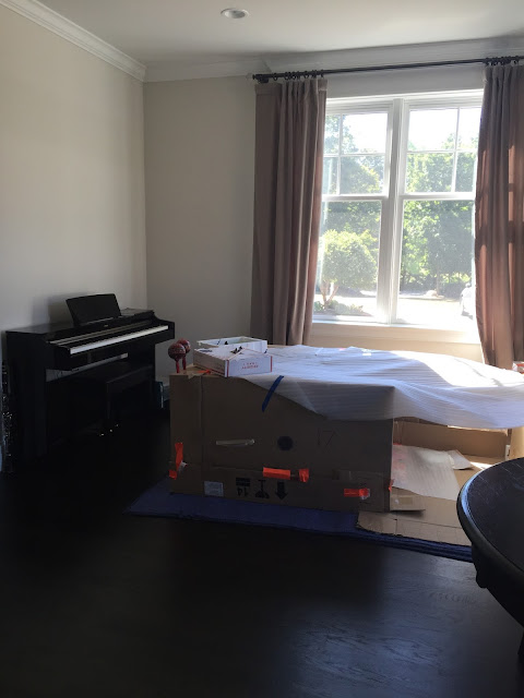
but first! the befores. it was a fort-building, piano-playing, little-bit-of-everything space.
the transformation is pretty awesome. i've shared snaps before on instagram but here are all of her angles. 😉 all photos are my own.
my clients have a lot of molding in their home already so we added some boxes and chair rail to the walls for some interest. we waited over 5 months for this lamp and i have to say, it was worth waiting for!
the blue and white floral drapery is everything! i chose a deep, warm gray (benjamin moore amherst gray) to balance the bold pattern.
i kept the accessories within the same color palette as the rest of the room. the glass coffee table really keeps everything feeling light.
there are built ins between the living room and family room (that room is coming next!) and i did just some simple styling here - simple really is best! we chose to keep the window and door casings white to make them really pop against the gray.
the art tied the whole space together and i'm so happy my clients went for it!
the leather chairs bring some much needed texture and warmth to the room but the casters and sleek frame keep them refined.
one last artsy detail shot looking through the coffee table!


6 comments:
Love it! Nice work, MR.
It looks absolutely amazing, Meredith! The molding on the walls just takes it to a whole new level! xx
Where is that table lamp from?!
Thank you Art mwah ;)
Thank you so much Kelly! I agree!
Sorry I can't share sources for client project!
Post a Comment