Showing posts with label inspiration boards. Show all posts

August 4, 2016

Coffee Table Styling

no need for a cute title on this post - let's get right to business! chairish asked me to participate in a blog post series about styling coffee tables and it just so happens i wanted to do a post on that very subject so win-win! my own coffee table isn't exactly well styled at the moment because with little kids comes breakage and i'd rather just avoid that for the time being. but when i do style my coffee table, i still try to keep it kid-friendly because that's just life and i actually wouldn't have it any other way!

first a couple of inspiration images from the zhush - sue always seems to have perfectly curated coffee tables!


chairish gave a bunch of coffee tables to choose from and i landed on this one - i love the clean lines and the parquet top. if it were mine, i'd probably try to strip it and lighten it up. it's teak so there is good potential. it's also a great size (61") so you can style away without running out of room.


my styling tips are simple and fairly fail-proof i think. it's all about depth and texture.

1. buy pretty books and stack them - two to three high is ideal. i choose design books obvi but they can be any pretty book. i do think a nice spine is a plus or a pretty cover. you don't want to use some weird paperback you got 15 years ago that's now all yellow. ;) here are my picks (each title is linked):


2. add some green and add some gold - both add great texture.

i keep my green faux. between the dog and kids who still put things in their mouths occasionally, i don't need anyone ingesting a cactus. this potted plant from west elm fits the bill.

for the "gold" i like to add something funky - it's small so why not. i love this bowl from wisteria and i'd pop it on top of a stack of books.

3. always a tray! they help organize the smaller items that you want to display and look polished and neat. serena & lily's lacquer and rattan tray is a favorite and i'd choose the large size.

4. accessories - the pretty things that go on the tray! this includes more books - take a couple of the smaller size books, stack those inside the tray too and put one of the accessories below on top.

i always like to have coasters so everyone has a spot to rest their drink without putting a circle on that pretty wood. these onyx ones from one kings lane are purdy!

i also like to include a box of some sort - this bone one is light and adds texture with the bone. glass could be another option here.

a piece of ceramic is always on my list. again it's another texture that hasn't been introduced yet and is a great way to add color or pattern. i love this one from anthropologie.

depending on space, a candle is another good choice. again i steered away from a tall glass hurricane style though that would give nice height. i'm more of a diffuser person myself but wanted to throw that out there for you candle lovers. :)

the key is to play around with all the elements until you've found just the right mix. i probably change things around 10 times before i'm happy with how it looks. i've kept my styling fairly neutral - the books look busy not the board but stacked they are a lot calmer - and i find it's a color palette that works for every day.

May 18, 2016

Pattern Play With Pillows

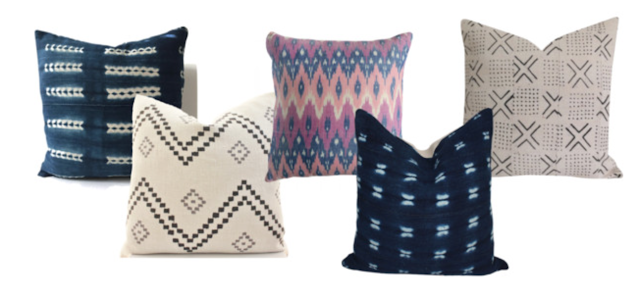
today i thought i'd talk about one of my most favorite things - mixing pillows! a question i'm asked a lot is how do i know what fabrics/patterns to put together. it definitely takes practice but when you get the mix just right, you know it.

one trick is to use patterns all from one line where they're all made to work together. you can't go wrong! i would probably throw in one more solid to finish it off.

[studio mcgee mix and match]

so you want that boho vibe? choose indigo, black and white and one or two pops of color.

[laid back cool]


another idea - pick one color palette and stick to it but mix up patterns both in scale and type.

[tonal]


sometimes what works best feels counter intuitive.  opposites attract and the unexpected mix makes this combo a winner. the mud cloth is funky but the colors are subtle. the pinstripe is classic but the olive color makes it interesting. and the pink pillow softens the whole thing and makes it pretty. you might see this one again in the future, just sayin!

[wild card]


April 14, 2016

Dining Room Scheming & Dreaming

as you well know, i'm a changer upper. for a good long while now my dining room and i haven't been the best of friends. it's in this weird neither here nor there state. the navy walls are pretty but they feel heavy to me. i've been wanting to wallpaper but both budget and indecision have been holding me back. see here and here.

i decided to try going bold and see how i liked it...


chairs, table, similar rug, and console are currently in the room. the light fixture is a bit of a dream because we have a different version of this same one that used to be in our kitchen. i love this big one so i added it to this board for fun but it wouldn't be reality. that art is a piece i've admired for years. it would be a "commitment" financially but would also make an awesome statement. the boldest element is clearly that blue and white wallpaper. and in person (because i have a swatch) it's actually brighter and bolder. i like the beachy colorful vibe it gives off.

i think this look is a contender - what do you think?

March 7, 2016

Tricked Out Laundry

hiiiiii!! i am the worstest most terrible blogger ever. sorry! i need more hours in the day. and also more sleep but who doesn't need that?! so anyway lately i've been dreaming about tricking out our laundry room a little more. i think it's still not as functional as it could be and even after wallpapering i still can't get over how much i hate the flooring. so i put together a a couple of design boards with the main difference being the floor. could also keep the cabinets white - currently they're a bleh off white so regardless i'd like to paint them. would love to hear your thoughts on both!


p.s. my downton abbey cohorts. best ending ever maybe? i like knowing everyone is going to be happy. :) but one tiny thing that irks me - why didn't they say the name of anna's baby?! did i miss it?

September 15, 2015

Modern Rustic Dining Room

i'm working with a new client and we're trying to hone in on her design style so i pulled together a board based entirely around the color of her walls (silver sage by benjamin moore) which is the only thing that will be staying as-is in the room. i did it to help visualize an overall look - there were parts and pieces that appealed to her but it didn't wow her. and that's ok! it's a fun part of the process to figure out what really speaks to someone. regardless, i thought it was a pretty room and if anyone out there wants help creating it in their home, let me know!! haha!


August 4, 2015

More Bedroom Dreaming!

ok friends, i'm back at it. i basically spent the weekend on polyvore, my new best friend. it's so easy - i can't believe i ever thought it was hard! i read parts of this awesome tutorial to get me started and even the posts were written in 2012, most of it still applies.

so today i'm back to dreaming about our master bedroom. i made one board a while ago that was frankly just so so. but this one. this one i'm dying over. it's so calm and peaceful and i want to dive in that bed right now!

master bedroom

it's kind of amazing sometimes how much my tastes have changed over the years and how much i now crave calming spaces. anyway! i keep making these boards and my hubby keeps shaking his head. so obviously my thought process is - if i make enough of them, then by the laws of {statistics? attraction? physics? ha} he's bound to like one. and we already own the wallpaper so i mean it's kind of a slam dunk, no?

June 9, 2015

Playroom Inspo

hi y'all! not sure how much blogging is going to happen this week but at least this one post :) as per usual i've been doing a lot of dreaming and scheming - this time about changes to our basement playroom. i've mentioned before that our basement isn't a typical basement - it's bright and light with full size windows and a french door to the patio. so it truly feels like another room in our house.


oh and the bedroom that i posted on instagram this past weekend is down there too! anyway, the sectional is working out great down there, we love it. but i've been looking at those same pillows for about 8 years now - seriously they've been in all three of our homes - and they're looking terrible. all stained from formula and the turquoise and brown isn't really a hot combo. we've been using them because it's what we had but i started to think it's time for a refresh.

one thing always, always, always leads to another and i began thinking about what else i'd like to do down there to brighten and freshen the space. here is my inspiration image (design by studio mcgee):


gah those built ins! dreamy. here's what i came up with...


the first thing that is screaming at me is the current wall color. it's dingy. a coat of fresh white paint would be so perfect for this room. with the white paint, i thought the blue herringbone would be really crisp. it's available as both a fabric and wallpaper so i imagine using it for roman shades on the windows and then papering the wall where the stripes are (see pic above). and i think the animal  heads would look great against it! next, in that bay where the windows and door are, i'd love to hang two rattan chairs. not entirely practical at this stage of life with little ones but i can totally envision them! especially with a really pretty cushion like the striped one at the top right. ;)  then moving to the wall where i added the big clothespins for displaying artwork (this post), i recently swapped out a tall white ikea expedit bookcase for a shorter gloss gray one that we had in storage. the shorter size opens up room for a nice big piece of art above and those squares in navy, pink, and orange (bottom left above) would look great with the pillows. and speaking of the pillows, let's just be honest here - you know all of them are already sitting on my sofa lol!! all of the other furniture stays with the hope/wish/intent that one day we will be able to add some nice built-ins along the wall that i never photograph b/c it's so ugly! but basically where the sectional faces in the first picture above.

i think this could easily become my favorite space in the house! a little pink never hurt anyone right? not everything needs to be designed for boys only. at least not until they have opinions on these things!!

December 17, 2014

Bedroom Dreaming

hi friends! you might have seen on instagram a little sneak peek of our updated family room! see this post where i talked about the switch we did. i love how it's coming along so far!


anyway...i saw this room on pinterest and loved the soft, neutral and feminine color palette. gray, white, pale pink, and brass.


but wouldn't it would be so pretty as a bedroom scheme? so i did some dreaming and threw together some ideas!


happy hump day y'all!

July 21, 2014

Design Board: F's Big Boy Room

a week ago i shared my ideas for c's big boy room and this week i'm onto f's. this room has been so much harder for me to design because it's pushing me out of my comfort zone which i think is a really good thing! i got into a funk with ideas so i went back to the basics - what colors? i stared at the alphabet print that's in his room currently and pulled all of the colors out of there. light blue, navy, grey, and brown with a pop of orange. this also ties in the current wall color (blue) and ceiling (grey and white stripes).

since the walls and ceiling already make a statement, i wanted to keep the main pieces of furniture simple. and also warm - there are a lot of cool colors going on so need to bring in some warmth through textures. i came up with two ideas using different bed options. and i need HELP!!

option 1: woven headboard. this would obviously require a bed skirt too - not sure how i feel about that. the dresser in the lower left corner stays and the lamp in the bottom left corner is already in the room. the bedding is serena and lily given to us by my mom when we did our bed swap (they took our two twin beds and gave us one full size).


options 2: upholstered bed. i like the fully upholstered look but it's a pretty similar style to charlie's bed and i wanted each room to be unique.


so what do you think? ideas and (friendly) opinions welcome :)

July 14, 2014

Design Board: C's Big Boy Room

hey! did i ever tell you how much i love summer? it's just so much easier than the cold months and everyone is relaxed and tan. haha! we went into boston on saturday and it made us both wish we either lived closer or went more often. it's so good for the boys to see the city with all the noises and action and different people. we were feeling way too surburban!

this weekend in addition to some real work-work, i did some fun-work dreaming up just how i imagine the boys' rooms to look. i'm starting with charlie's because his is right in my wheelhouse. it's going to be nautical playing off the colors that are already going on in there - mainly blues and red. my achilles heel is always editing. i end up having so many different ideas that i wind up with way too much going on. the other risk is making it too theme-y. definitely want to avoid that so i need to think of unexpected things that will make it fresh.

so here's what i pulled together...


some of these things are currently in the room like the lamps and striped curtains that i'm keeping. i also bought the red toile shams from serena and lily forever ago and have been storing them away. unfortunately there was a dark ikea dresser (see pic below) that completely fell apart any time i put more than three shirts in it so we had to get rid of it. otherwise i would have worked that in too.

the other thing that's been a real challenge in this room is space planning. it's a bit of a funky shape. kind of a square but then has this closet and other area to the side. here's what it looked like as a playroom as a reminder of the space.

(view from the door - door on the right is into the bathroom)

(view from the nook space)

(closet on the right and nook space)


my original idea was to do two twin beds but as i began to play around with a tape measure i didn't love  any of the options where they would fit. also the idea of laying down in a twin bed (bound to happen, especially with C) wasn't very appealing to us so we quickly switched tacks to a full size bed.

with that in mind, there are two main places to put the bed - on the same wall as the door (right side of the middle pic above) or directly across from that on the wall in front of the windows. i think it's so much more welcoming to walk into a room where (if possible) the bed is facing you instead of facing away from you. so i'm going with the more unconventional choice of putting the bed in front of the double windows. as of now i'm thinking the dresser will go on the same wall as the bathroom door (space straight ahead in the middle pic above).

i'm excited! i think it will be cute - but not too cute so it lasts a while. that's another goal too - the main pieces like the bed, nightstand, dresser have to grow with him so he likes them still at 15. (15!!! ahh!)

November 22, 2013

Client Project - Living Room Refresh!

have you guys ever watched vanilla ice's house makeover show on hgtv? i just caught an episode last night where he was redoing houses in amish country. SO weird!!

so a guy friend of mine recently "hired" me (i still use quotes because i'm not a real designer, let's face it) to help give his living room a little refresh. all of the bones are there but it's lacking in color and softness. his requests were: a new rug, pillows, and art. here is the before:


and here is a little board i put together to sell him on my ideas :)


the sofa and fabulous wing back (from rh if you're interested) are already in the room (you can see those above). i'm still working on artwork but that takes time since it's pretty personal. but i'm loving the pillows and color combos. orange and blue are his favorite colors so i wanted to be sure to incorporate both. we plan to add a navy blue band on the orange pillow which btw is velvet and so yummy! for the rug we're hoping to find something persian but have you looked at persian rug prices lately? even this one is $2200! ebay has some good stuff but it' so hard to buy a rug online. craigslist has some good finds too but you have to act fast.

next up, dining room window treatments for the same client! have a lovely weekend and try to stay warm - winter has arrived in the arctic north!

September 6, 2013

Bachelor Pad Dining Area

it's just gonna be a bachelor week! the dining area in my brother-in-law's new pad is on the small side - more like a nook - so the furniture needs to be scaled accordingly. i admit - it's not very exciting - but it was important that it blend with the living room since the rooms are so close to each other.


i love love love these chairs and wish i had a place for them in my house. only $79!! i chose them because you can see right through (duh!) but what i mean is that your eye doesn't stop which hopefully would keep the space feeling as open as possible. and i love the mid-century feel of the table. the rug is jute with a little chevron pattern for some interest.

i hope you're feeling inspired - i am!! have a great weekend!

September 5, 2013

Bachelor Pad Living Room

i've been hard at work on ideas for my brother-in-law's new bachelor pad and i am loooving how it is coming together! first up, the living room. his requests were a couch that he can lie down on (he's 6'2") but that will fit in the elevator in his building (which is tiny), a leather chair, a bar area, coffee table, and area rug. oh and there has to be blue, we are all huge fans of the color blue!


my overall idea was to go a little more modern than maybe where his comfort zone is. this is not suburbia after all (although i think this design could really work anywhere)! but at the same time i wanted it to feel homey. i also want him to impress the potential lady friends who may visit. :)

for the sofa i picked a mini sectional that has a chaise on one end. i thought that would work best since it can split into two parts to get in the building and he can stretch out on it two ways. still not really sure if it will fit but the idea is there! i also took a cue from sarah richardon's design and used schumacher's chiang mai (aqua colorway though instead of alabaster). not flowery but great colors. the leather chair is my favorite - nailheads along the bottom, not so huge that it will take over the room, and in a yummy honey brown.

so what do you think? does it say sophisticated bachelor?! :)

October 29, 2012

Girly?

us east-coasters are hunkering down for sandy - day care is closed today and we shall see if that was necessary or not. :) but my mind is not on sandy, it's on the rug sale at west elm. and specifically the safari rug:


there is a bit of a debate going on at my house so i feel the need to get the blog world's opinions...is this rug girly? my contention - no, it's gender neutral. but the husband sees it differently. so what do you think? and not to sway your opinion too much (but it is my blog after all), here's a little board i put together with some items i'm thinking of for the big boy room.


clockwise from top left:

headboard: pb kids
lamp: rh baby
nightstand: ikea
ring pull: home depot (unfortunately out of stock)
woven roman shade: the shade store
eames-style rocker: land of nod
pouf: cb2
alphabet print: rh baby (blogged about it before!)
curtain panels: castle creek designs on etsy, fabric from premier prints
background color: hinting blue by sherwin williams

April 26, 2012

Navy, Pink, and Gray Bedroom

our bedroom has, sadly, never been one of my favorite spaces in terms of design. i think a lot of people leave their bedroom as the last place they get around to decorating. it's a shame really because it's a room you spend a lot of time in. and just because no one else sees it doesn't mean it shouldn't be pretty!

so i have vowed that in our new house (yes we have one, no we haven't sold ours yet. ugh) i will give us a beautiful room to rest our heads. although it may take some time for it to come to fruition. :) i gave the hubby a choice of navy, yellow, and gray or navy, pink, and gray. much to my surprise (and delight!) he chose pink over yellow. so here is what i plan to do, featuring caitlin wilson textiles:


wall color: woodlawn blue benjamin moore
bench: ballard designs
lamp: robert abbey
roman shade: restoration hardware
bed: williams sonoma home
rug: dash & albert
mirror: wisteria
side table: williams sonoma home
fabrics: caitlin wilson textiles

December 16, 2011

Yellow, Coral, and Gray

so my etsy purchase didn't arrive today as usps said it would. will have to save that for next week. in the meantime...this month's instyle magazine had a little bedroom makeover section and featured this room by krista ewart:


it caught my eye because i used this same room as inspiration for an office makeover for a friend. they clearly must read my blog!


i have to say that i love this combination. it's fresh and happy - anyone want help turning these colors into a room??

March 4, 2011

Hall Bath: Color Inspiration and Materials

sorry for the lack of/late posting! busy busy here at casa R! so, the bathroom...

the main goal in this bathroom is to create something i love and at the same time something that would appeal to others as well. we have absolutely no plans to sell our house but i always keep resale in the back of my mind. the first color scheme that popped in my head when i thought about redoing the bathroom was crisp white and mint green. very clean and very fresh. but i was struggling with what other colors to add to the mix and what all of the finishes would look like.

then new color inspiration came when i saw this bathroom in the HB feb 2011 issue designed by ken fulk. i posted about this bath before and i wish i could find a better pic than my scanned version but nonetheless...


and the palette of white, tan, and lavender was born! now clearly my little bathroom will not have the luxe finishes that this one does or the grandeur of a stand alone tub. but it gave me a really clear vision for what i wanted to do.

we recently placed orders for the cabinetry, tile, tub, and faucets so i thought i'd pull together a board of the materials.


here's a run down of the items that are going in the new bathroom and why i chose them (clockwise from top left - warning - this is gonna be long!):
  1. shaker style cabinet door - i tend to go for simple door styles because they're classic and will go with so many styles and finishes.
  2. glossy white subway tile - this particular tile has the appearance of being handmade because the surface is not perfectly flat (which you can't tell in this pic) BUT, and it's a big but, this tile is machine made which means saving $$.
  3. kohler memoirs tub - this tub has some nice detail to it. i didn't want just a plain white run-of-the-mill tub. those are everywhere. plus the toilet that is already in the bathroom is also part of the kohler memoirs line so it flows. oh and the drain will be chrome, not brass like above!
  4. restoration hardware chatham sconce - i love me anything bath-related from restoration hardware and the quality is fantastic. they run an annual bath event where everything is 25% off so i took advantage. the toilet paper holder and towel bar will also be from the chatham collection.
  5. white travertine tile - this is going to be our floor laid in a herringbone pattern. the little square at the top right of the picture is the counter which i'll get to in #8. travertine is not cheap but i happened to luck out that the tile company i work with is moving locations and was willing to get their last batch of 3x6 travertine out the door at half price. so it made the cost nearly the same as going with a porcelain or ceramic tile. these tiles will get sealed and will darken slightly to a sandy color.
  6. landsend lilac towels - these towels have to be the best deal out there and currently monogramming is free!
  7. rohl verona faucet - like the cabinets, i'm keeping the faucets clean and simple in this bathroom. and they're arched enough to comfortably get your hands underneath.
  8. cambria coswell cream counter - can i just say how much i love cambria. it's a natural quartz material that needs no maintenance. granite and marble need to be sealed every 6 mos - 1 year and this needs only soap and water for life. we have it in black in our downstairs bathroom and you wouldn't know it's not granite.
outstanding items - i'm still trying to decide whether to do some sort of wainscoting. not beadboard but something painted out white with a chair rail. secondly i still need to figure out knobs. i'm leaning towards some kind of vintage cut glass but haven't found just the right ones yet.

one tip i learned from previous bathroom renovations is that polished chrome is the cheapest finish available. personally, i prefer polished nickel which has a much warmer feel when side by side with chrome. but here's the thing - you're not going to ever see them side by side and chrome achieves the same overall look so it's possibly not worth going with nickel if you have to purchase a lot of things in that finish. 

another tip i've heard - pick all of your porcelain (tub, sink, toilet) from the same company to ensure that the whites all match. but actually i'm not sure i believe it completely because we have a toto toilet and kolher sink in our master bath and if there's a difference in color, you'd have to be superman to tell.

and if you read through all of this then you really are superman. or superwoman. wonder woman? :) have a great weekend!

February 25, 2011

Green, Yellow, and Pink Oh My!

i saw this post over at the designer's attic the other day and i can't get it out of my head. i absolutely loved everything shannon put together and i wish i had bought the "room in a box"! but since i had a slow trigger finger, i also thought i could re-create it with some similar but less expensive fabrics. the fabrics in the original post are tres expensive!


i think it's important to keep the main fabric which pulls all of the others together. it's china seas macao II in jungle and it's the splurge. you've seen it before in this post but here it is again (on the chairs, room by palmer weiss):


i can see it all looking fabulously lots of places but i have bedrooms on the brain at the moment. perhaps a bedroom in my own home? ha! so i had to create a quick inspiration board (resources below):


clockwise from top left:

  1. marble top dresser - williams sonoma home (my dream piece!)
  2. green embroidered bedding - pottery barn
  3. ceramic lamp - robert abbey
  4. floral fabric - china seas
  5. fresh cut grass paint - benjamin moore
  6. pink trellis fabric - waverly
  7. yellow lattice fabric - calico corners
  8. spotted ikat fabric - premier prints

February 13, 2011

First Client Project

that's right! i'm going places baby. ok, i might be getting a little ahead of myself but a few people have contacted me to help them with projects and i couldn't be happier. my initiation is with a friend of mine who can't stand looking at the curtains in her bedroom. i am quite sympathetic to this complaint.

since this is my first official client project, i thought i'd share some of my thought process. our first step was for me to stand in her bedroom. even though i've been to her house many times, i haven't been in her bedroom probably more than once. then we gotta talk money. what's the budget? then determine the things she likes in the room and the things she doesn't. next up is the color palette. as with most projects, there are many pieces that need to stay in the room and we need to work with. her existing bed and armoire which are a creamy white and her blue summer duvet were two of those things. and she also loved the color of the walls (as do i) which is a bright and cheery yellow.

so our color story was built around blues, yellow, and off white. a few swatches and lots of e-browsing later, here is the fabric we landed on:


of course with most projects, they have a tendency to expand :)  other than window treatments, we are already talking rugs, lighting, and bedding too. so i created a little inspiration board for the room.


we won't be able to do everything at once, who can? but this at least maps out the direction that we're heading in. befores and afters to come!

August 10, 2010

Living Room Inspiration Board

i've never done an inspiration board before. i've always come up with color palettes in my head but never put them to paper so-to-speak. our house was built in the 80s and just about every corner of it is in major need of a makeover which is actually part of what attracted me to it in the first place. and the living room is no exception. soooo here is my first attempt at an inspiration board.

the color scheme for the room is navy, pale blue, kelly green, and ivory. one constraint - i need to incorporate two existing chairs that i love.


clockwise from top left: navy grasscloth wallpaper from seabrook, restoration hardware nesting tables, kelly wearstler's imperial trellis in trelliage by schumacher, ceramic garden stools from wisteria, mitchell gold + bob williams ashton chair, sky blue cotton basketweave from calico corners, ballard castered ottoman, ceramic owl from hornsea, monterey sofa with waterfall skirt (but not with the tufting as shown here on the back cushions) from ethan allen, navy ticking stripe fabric from mgbw, robert abbey triple gourd lamp

the room i am working with! (picture taken when we bought the house with previous owners' sofas):


room as it looks right now (someone enjoys the camera):


for some reason i decided to paint the room yellow when we moved in which was a mistake. so far, with the help of our contractor, i added a chair rail. bought the chairs and lamps which were my first purchases toward the project. actually one of the chairs was a very nice christmas present (thanks mom and dad!). had pillows made to attempt to dress up the ratty couch from my first apartment that is covered in stains and dog hair which luckily can't be seen in in this picture. :) and a cheapo coffee table that is badly scratched from lily's puppy days. the carpet is what it is - in my "10 year plan" i hope to do hardwood but for now i have plans to add an area rug to hide some of the nasty gray. more on that later! btw please ignore the too-short curtains. they are from our old house and haven't been lengthened for the ceiling height in this house.

i'll post photos of the work in progress and (one day) the final product!
Related Posts with Thumbnails
 

design + development by kelly christine studio