Showing posts with label my projects. Show all posts

June 12, 2019

Basement Bath: Towels and Art

thank you so much for all of the sweet comments on instagram about the basement bathroom reno! i'm thrilled you love it! today I wanted to share one small part that I didn't include in the other post. there was so much info and I was afraid it would get lost in the shuffle! a while back weezie towels reached out and asked if I wanted to partner with them and this bathroom project turned out to bet he perfect opportunity.

i've said it many times before but I partner with companies who I genuinely like and whose products I will actually use in my own home. and now for the cheesy but true part, I never thought i'd be excited about towels but these are seriously awesome. there is just something about nice towels right? the design is simple, which I love, and they have great color choices for the piping and monogram. I chose grey but they have eight colors to choose from including white if color isn't your thing.


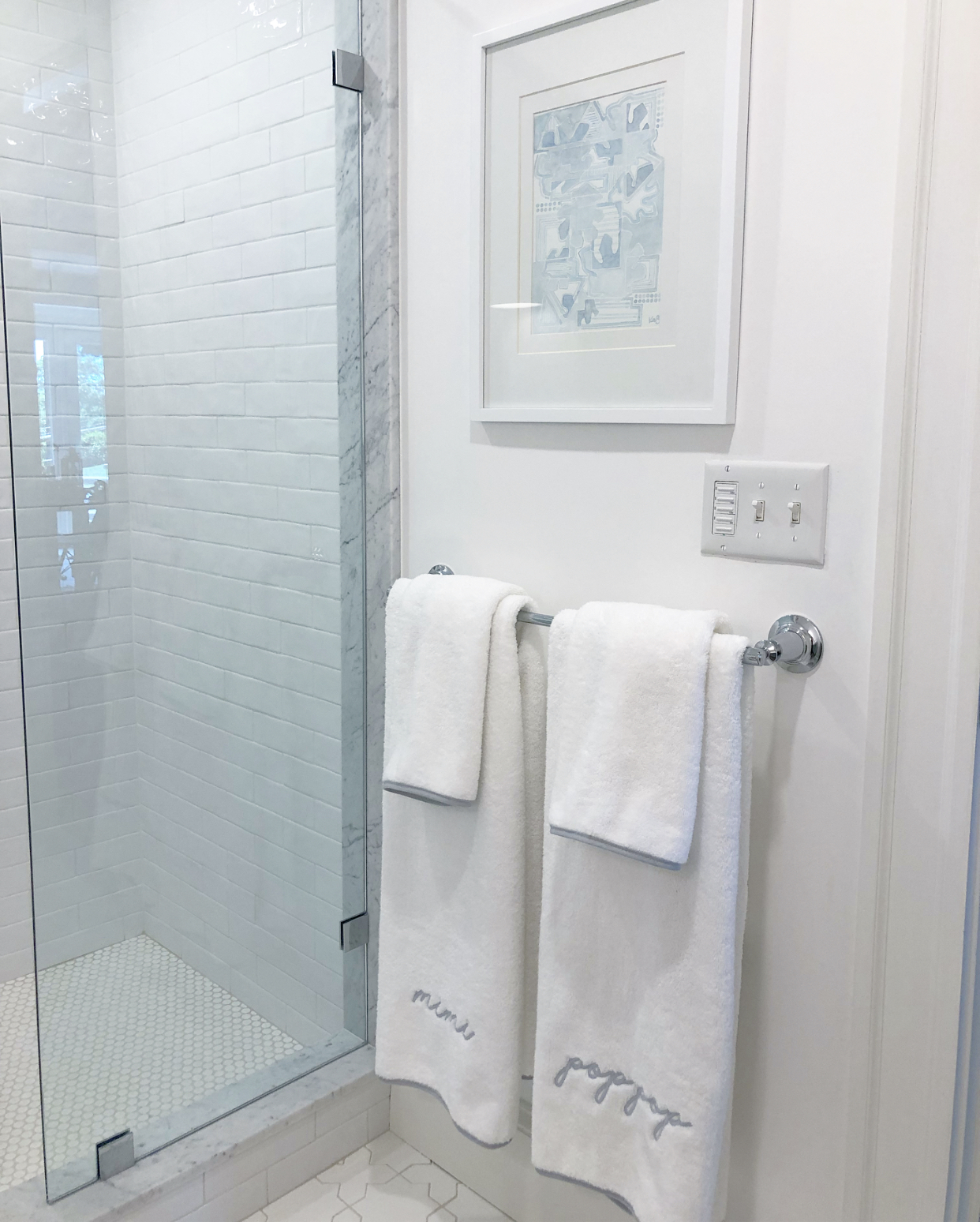
on the monogram front there are a bunch of options too (see here)! since this bathroom is the one my parents use when they visit, I thought it would be fun to get their "grandparent names" embroidered.


the towels are truly soft, thick, and absorbent. they also have a loop to hang from a hook in case you aren't a towel bar person. i'm actually a fan of hooks but with the space here, a bar made more sense.

taking photos of this bathroom was nearly impossible since there isn't a window for natural light. I contorted myself into some odd angles and got really up close and personal with the the toilet to get some shots but they are still blurry! anyway, I also wanted to share the art from kate scialabba that I hung above the towels. this is the actual piece.


I have been a fan of kate's work for a while and when she contacted and asked if I would like one of her pieces I couldn't say yet fast enough. I put it in this frame that I already had and it's the perfect addition! but take my word for it that it looks better in person than this shot!


SOURCES

June 11, 2019

Basement Bath Redo

I have been so excited to write this post for so many reasons but mostly because it means our basement bathroom project is finally finished! this project has been a long time coming - it was plain jane with a fiberglass molded shower insert, some ugly tile, and a lovely yellow and tan color palette. at first I thought we might just do a refresh like in the upstairs bathroom with paint, a little tile, and a new counter. but as i thought about it more, a full gut was the right way to go. here are all nitty gritty details on every part of the project so if you're here for the sources, scroll down to the bottom!

let's take a look back at the befores, shall we?


for some reason I thought it would be a good idea to add a bicycle shower curtain and purple towels! actually it was more like that's what we had hanging around but either way, it was ugly!


and now for the afters and my thought process! first here are the original design ideas.


AFTER!


strangely the jumping off point was the sconces! do you ever see something - a tile, a piece of furniture, a light fixture (!) and immediately envision a space coming together? these sconces are kind of unique because they don't actually exist in this finish combination. they're sold as white with chrome and black with brass so I bought 2 of each and swapped the shades to create white with brass. I love them and their price tag! (and if you're interested, the other pair of black with chrome is available here!)


the next thing to fall in place was the floor tile. I had been eyeing this tile for a while and it was the perfect spot for it since it's a little pricey but with a small bathroom, we didn't need very much. it's fireclay tile's mini star and cross in white gloss. there are a bunch of white options and this one is a soft white. their tile is so beautiful, both in terms of patterns and colors. I love that it's handmade and completely embrace the imperfection that comes along with that. it was a little like a puzzle to layout! the grout is tec grout in sterling. I chose both the tile and grout colors, even though they are white and gray, to be on the warm side of those shades.


next came the vanity selection. I knew I wanted a muted color that had some gray in it but didn't read as flat gray. I love colors with some depth and ambiguity. I found the vanity that we ultimately used (here) and loved it but wanted to do a custom version to adjust the size down a bit and add a slatted bottom shelf instead of solid. sadly the pricing for custom was out of the budget or the lead time was too long so in the end I went with the retail vanity and I'm totally pleased with it. it's a couple of inches wider than I wanted but it's really not a big deal. the color is called "ocean" and honestly it's exactly what I wanted.


one thing I did was change out the pulls on the drawers. they were not good - stainless and dated looking - but such an easy fix with these inexpensive pulls. the brass looks so great on the "ocean" finish. I searched high and low for baskets that would fit on the shelf - there is only 11" of height - and found these great baskets with leather handles at target!

I purposely chose a vanity that was the "base only" (i.e. doesn't come with a top) in order to select the stone for the counter. if you follow me on instagram, you may have seen that at first I thought i'd use white quartz but after selecting it, I realized that the bathroom would be too white and frankly a little boring. so I made a call to united marble, who graciously sponsored a portion of this project, and asked what marble remnants they had. luckily they had a beautiful piece of honed carrara that was large enough for the counter, shower pieces, and threshold. the slab itself was 3cm but I asked them to build up the thickness to 2" for an added detail. I love how the chunkier counter looks and did the same detail in our powder room. side note - to keep costs in check I used a remnant instead of purchasing an entire slab. with a small project like this one, it's a good way to save some dough! also mitering the edge to create the look of a thicker counter, rather than finding a 5cm slab, is also a great trick and savings. oh and I always have the backsplash planed down to 3/4"!


the next decision was the shower tile. while I would have loved to continue the star and cross into the shower floor, the gloss finish that I liked, plus the size of the tile, would be too slippery. simple white penny tile did the trick and was good for the budget! I used this glossy white penny but it's widely available at a lot of stores. I used the same grout color here as the bathroom floor to keep it cohesive. I decided on a round drain to stay in keeping with the round shower trim.


for the walls I used this 3x8 handmade-looking tile from lowes! no one believes me that's it's a lowes tile but it is and it's awesome. the slight movement in the tile adds the texture that I always crave and i'll definitely use it again. they don't make a bullnose or pencil to match which was fine with me as I used the slab material for our curb and jambs to create a nice clean look. I kept things simple with a white grout on the shower walls - the movement in the tile was enough interest for my eye and I prefer the clean look of white grout.


for the faucet and shower fittings I used my tried and true kohler purist in chrome. I love the cross handles and clean lines. polished nickel would have been a warmer finish over the chrome but for the sake of the budget I used chrome and it doesn't bother me. someone asked me why used brass for some areas and chrome in others and the answer is I love mixing metals! it's a lot more interesting to my eye and creates a more eclectic look rather than everything matching. using the same can sometimes be the right choice but in here, mixing felt right.

the niche was a great addition and framing it out in the same slab material (carrara) was a no brainer. the question was whether to line the back in penny tile or to continue the subway. I asked the question on instagram and it was definitely split but i'm glad I went for the simpler look with the subway. we designed the size of the niche based on the courses of tile so it really is seamless! as with all of the tile, the install by united marble was done so carefully which is a detail that I really appreciate.


one of the pieces that was actually difficult to find was the mirror. between the width of the sconces and the length of the vanity, I needed a fairly slim mirror. obviously I didn't want to sacrifice on style (duh!) so I ended up finding a medicine cabinet that fit the dimensions to a tee. we weren't planning on a medicine cabinet at the start but sometimes you have to be flexible! brass was my finish of choice and I always love the simple rounded corner rectangular shape. it feels modern and warm at the same time.


I used the kohler purist toilet paper holder and turned it vertically to fit the space. instead of hooks, I used the kohler archer towel bar. the bank of switches didn't leave a ton of wall space so this solution worked well. it did cause the shower door to have to open on the toilet side - the glass would have hit the towel bar and wouldn't have been able to open out very far.


during demo we found a nice surprise - the old shower was framed to the specific size of the insert but when we removed it, we found extra space behind that was completely open. we ended up being able to move the wall back and make the shower a little larger. but maybe even better than that, there was still an open cavity below the fan so we framed that out and created open shelving. I love this little touch and have to give credit to my mom for the idea. since the vanity doesn't have much closed storage, it's nice to have a few spots to hide more stuff!

last was paint - I chose one of my go-to whites, simply white from benajmin moore, for both the walls and trim. the walls are a washable matte and the trim is satin. simply white reads white but has warmth - so important to keep things from going too sterile.

and that's it! tell me if you have any questions!

SOURCES

May 14, 2018

My House: Laundry Room Reveal

alrighty! it's that time to finally share our renovated laundry room here on the old blog. thank you to everyone who followed along on my instagram stories as i went through my design process. i went completely dark on you, sorry! similar to the hall bathroom project i shared, this room was pretty hard to photograph with the one window and narrow space. i did my best!  *all sources are at the end of this post*

BEFORE:


and another iteration of BEFORE! pretty, but not me.


AFTER:


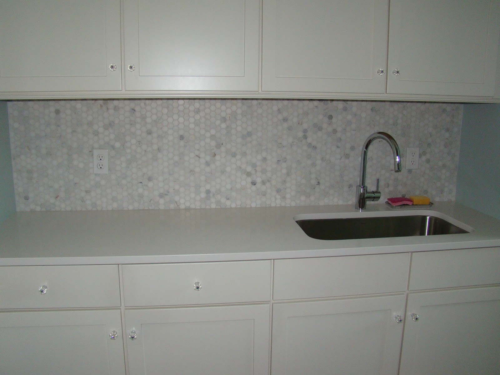
our laundry has had several iterations of "before" - it started as the most blah, boring space imaginable complete with formica countertop, a small over mount sink, and a faucet that moved from side to side when you turned the handle. the finishes weren't up to par with the rest of the house which was odd and annoying. the first thing i did was replace the counter with white quartz, add a big undermount sink, sleek faucet, and add a marble hexagon backsplash probably about 3 years ago.

BEFORE #2:


i painted the walls, even wallpapered them, but still was never quite satisfied. basically i was trying to put lipstick on a pig and not tackle the real issue which was the flooring. here's the original flooring:

BEFORE #3:


sometimes it looked blue, sometimes purple, but every time it looked UGLY! anyone who followed along on instagram likely knows that in the end i went with a honed black slate and laid it in a herringbone pattern. the tiles are 3x12 and i love how it turned out.

(yes we have an old school telephone!!!)

but if you're going to change the floors, you might as well take the opportunity to really change the whole space. 😉  in addition to flooring, my list included paint, a wall treatment, shelving, additional cabinetry and lighting.


the decision that plagued me the most by far was the paint color for the cabinets. i knew i wanted to paint them - they were that same cream color as the rest of the house and to me that color just looked dirty, especially with the white quartz counter - and i wanted to have some fun with the color so i opted not to do white. but i went around and around from beige to blue/green to dark green and then finally greige. i didn't want straight gray cabinets - that to me felt too cold and lacked depth. the color needed to feel light and warm and interesting. knowing that black slate would be on the floor, i was hyper-focused on ensuring that the rest of the space had plenty of warm elements to balance out all of that black. the winner was agreeable gray by sherwin williams and what's funny is that i originally eliminated it because i thought it was too gray but i'm so glad i took a second look - it really does read that perfect greige color.


as with our hall bathroom, everything in this space was sprayed. i wanted that no-brush-mark finish which spraying delivers.

another big design decision was to add vertical boards to the walls (like shiplap but hung vertically). i knew going in that i wanted to add some millwork for interest and found these mdf boards that were pre-milled to create about a 1/8" gap between the boards. they were called nickel gap boards but the space is definitely larger than a nickel. after adding the vertical planking, we realized that we needed to add crown moulding to finish off the ceiling - our ceiling had a small angle at the top and the crown hid that perfectly.


another big piece to the project was adding functionality. the space above the washer/dryer before didn't have any cabinetry - there was one long open shelf that i couldn't reach. i opted to add two cabinets on each end and a white oak floating shelf in between. the new shelf doesn't add much function but it adds texture and warmth plus a space to style. :) it also gives the rod something to relate to. there wasn't any light on this side of the room, so we added one that feels perfectly utilitarian to me.

the new shelves are white oak and i love how they came out. i added one to the nook under the window to add a little folding station there and have a spot to tuck our rolling hamper underneath.


i toyed with adding a cabinet to the left of the washing machine but didn't love the imbalance that would create with the right side so i left it open. it turned out that the double steele laundry cart fit perfectly in that spot!


the hardware was a bit of a labor of love. i wanted the warmth of brass but i didn't want it to feel overly modern or shiny. so i took unlacquered brass knobs and pulls and aged them myself instead of waiting for that natural patina. i'm very happy with how they turned out!


i'm still waiting on fabric for a roman shade for the window and when that comes, i'll share that final touch! but even without it, i'm SO happy with this spot now. goes to show - don't cheap out and do it right the first time!


SOURCES!


paint color: sherwin williams agreeable gray
floor tile: honed black slate 3x12
grout color: tec grout in mist

May 8, 2018

Hall Bath Refresh

thanks so much for the love on yesterday's instagram post about our hall bath redo! i'm back today to share all of the details from the project and the decision process that went into creating this space. the saddest and worst part is that i don't have a proper "before" shot. can you believe it?? i feel SO dumb for not snapping at least one before any of the work started. i videoed it a ton on instagram but here is as close as i can come to a before pic.  *all sources listed at the end of the post!*

BEFORE


at this point the new tile is already installed in this shot. the old tile was 12x12 white squares. just plain and blah. also the new knobs are already in here - before they were chrome. and lastly the new mirror was already hanging in this pic - the old one was "built-in" - a piece of glass glued to the wall with a painted wood frame around it. we have them all over the house luckily so there are ones just like it in three other bathrooms.  ðŸ™ˆ

in case you're new here, i should add that our home was a spec house and completed by the time we found it so i had no say in any of the finishes. the vanity is the same color and style as every other piece of original cabinetry in our home. it's lovely but gets boring after a while since everything is that same off white tone. the countertop material was crema marble and is also repeated in every bathroom in our home (except our powder room which was just an integrated sink top before i changed that!). it's nice but not at all my taste. the walls in here were green and the original color from the builder - one of the only rooms that i hadn't yet repainted. basically design-wise the whole space had no rhyme or reason or flow.

AFTER


the funny thing is that this bathroom was never supposed to be included as part of the laundry room project i had planned. it's not a bathroom we use a lot so from that perspective, it was completely fine. however it's a spot i walk by approximately one million times a day and every time i walked by, all i could think was UGH. it was just so blah. so one day 8 or so boxes of tile showed up at our door and mr. r said "what the hell is that" and it all began. 😉 i figured if i had the tile, it would have to be done! more about the tile in a bit!


backing up to the very beginning though, the first thing i bought for the room was the serena & lily shower curtain - i got it on major sale probably a year ago. the whole room took direction from that curtain. it has warm tones and i liked the idea of doing a bathroom that feels warm instead of cold which can easily happen with marble, metals, and hard surfaces. i chose calacatta marble which has gold tones in a penny round shape to achieve that warmth. carrara marble, for example, is a lot grayer and reads a lot cooler.


one thing about calacatta is that it can have some very rust colored veining. when i went through the sheets, i saw about 4-6 pieces on each sheet that i wanted to remove before installing so that the overall look remained fairly light and a bit more uniform. this was an extra step, and my installers wanted to kill me, but it was worth it. i also removed any pieces that were super dark gray. i took a sharpie to all of the sheets to make sure the exact ones i wanted removed were in fact removed - pencil can be erased! you can see in the pic below holes where the pieces i x'd out were removed.


since the budget for this space was small, zero actually, i had to find places to save. a new vanity was totally out of the question so after i selected the tile, the next thing i chose was the new cabinet color. i toyed around with the idea of greige for a while but it was too "safe" and i thought this would be a good place to do something a little out of the ordinary since it's not somewhere we spend a lot of time. i chose retreat by sherwin williams and unlike in the laundry room where the right paint color eluded me for weeks, i knew it was the one from the beginning. to get the smoothest possible finish, i had it sprayed and the painters color matched it to benjamin advance paint which is latex but is meant for cabinetry. i like the satin finish best.


the mirror is also in the budget-friendly category! i liked the idea of wood over metal to again maintain some of that warmth. the deep frame makes it a little more modern. i also bought this a while ago and dreamed that one day it would replace one of our glued-on mirrors. i'm so happy it finally did!


another touch of warmth came from the brass fixtures and hardware. i used brass in the lighting - both the sconce above the mirror and the flushmount - as well as the hand towel hook. the knobs on the vanity in brass worked so well with the paint color.


i changed the countertop to white quartz which always creates a clean, sleek look and the sink to a rectangular shape instead of the traditional oval. i had the original faucet reinstalled, it's by grohe.


the toilet area got a little love with a new toilet paper holder and art courtesy of homegoods! i was browsing homegoods over a year ago and bought these palms without having a place to put them. sometimes it pays to buy something you like without knowing exactly where it will go!


the final touch was a bunch of white paint - i used simply white from benjamin moore here.

did i mention yet that this space was impossible to photograph?! it's super narrow and i don't have a wide angle camera lens so i don't think the photos really do it justice. the only way to get a straight on shot was this!


SOURCES


paint colors: 
cabinet - sherwin williams retreat
walls - benjamin moore simply white

March 7, 2018

Dark Green Cabinetry

we are about to get dumped on today with snow but while the weather people make a HUGE deal about it, it's honestly not looking that bad. kind of ironic because my maryland roots still hear 3" and think 😱 but here in massachusetts, that's considered a dusting and even 8" is cleared pretty quickly. my bet is that it will all melt pretty quickly because we're supposed to be in low 40s the rest of the week. the only real issue is that there is early dismissal in my town for schools. luckily my afternoon appointment is with a client who we are also friends with and i can bring the boys!

anywho! or anyhoodle as a friend of mine from minnesota says! if you've followed my laundry room progress on stories, you know that i'm struggling (massive understatement) with cabinetry paint color choice. ever since the flooring went in, i can NOT get this idea of dark green cabinetry out of my head. the flooring is 3x12 black honed slate laid in a herringbone pattern and i'm so happy with it.


i was laying in bed one night mulling over paint colors - honestly i have some of my best ideas right before falling asleep! - and dark green popped in my mind. i think it would look awesome with the brass hardware, slate floors, and white paneled walls. but it's a risk because i don't normally go for dark colors. and what if i get sick of it down the road? but since i can't stop thinking about it, i rounded up some images of dark green cabinetry for us all to drool over!

teddy edwards via bhg

deVOL kitchens

studio mcgee

deVOL kitchens

via farrow & ball

deVOL kitchens

kate marker interiors

via here

katie hackworth via AD

@rooted_kc

thoughts? maybe now that i've gone through this whole post, it's out of my system 😉
Related Posts with Thumbnails
 

design + development by kelly christine studio