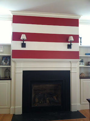
our fireplace used to look like this. no joke. i thought it would be a GREAT idea to paint red and white stripes. and how bad are those sconces? (at least i can say i didn't choose those!)
but the real point is that the height of the mantle plus the sconces made it impossible to mount a tv there - it would have been very small and at an uncomfortable height for viewing. along with the functional issues, aesthetically this surround was way too traditional for me. so i did a lot of pinterest sourcing and came away with this design that we tweaked for the application in this space.
we left the black honed granite that was already there - nothing was wrong with it. i would have liked marble and if it had been any other granite than black honed it would be gone!
one key to this design is keeping it beefy. too thin and you lose the definition and it becomes cheesy. but they're a fine line in my opinion on being too chunky where it starts to go cheesy. the details are minimal but enough to be interesting.
in terms of height, you can see that the top of the new surround is about even with the top first shelf (actually just a bit lower). in the original builder design in the first photo, the mantle was another 6-8" higher and that makes a difference! (beware of dinosaurs)
here are some more surrounds that keep it simple.
brooke wagner
better homes & gardens
amber interiors
boise interior design
amber interiors
calla mcnamara
studio mcgee
kate marker interiors


No comments:
Post a Comment