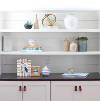
i've been meaning, for a while now, to post a small round up of some favorite paint colors that i come back to time and again. this is by no means an all inclusive list but these are colors that are tried and true keepers. one thing i want to mention is that, regardless of the color, i always recommend picking a shade that on the paint strip looks a little "dirty" or "muddy". sometimes this scares people but the pretty ones never end up looking sophisticated. long before i realized my passion for design, i picked a color for our bedroom in our first apartment and we might as well have been living in a swimming pool. but it looked so pretty on the chip! so learn from my mistakes and i think you'll see that all of my picks below are a bit dirty. :)
white dove: this color is throughout my house on trim and on walls. it's soft and warm but still reads "white" without feeling stark.
simply white: this color is on my basement walls. i wanted to try something a little different and to me, this white reads a little whiter than white dove but is still soft. this color can really go anywhere - walls, trim, cabinetry and even exteriors.
classic gray: i used this color in our master bedroom and it is so clean.
wind's breath: this color seems to be really hot at the moment BUT i found it and used it before its recent fame. we did a whole home this past fall in this shade and it's the perfect compromise between a warmer gray but without it going too tan.
fieldstone: i am loving this shade for cabinetry and also in the right color scheme, i think it could be a pretty exterior door color!
design by classic casual home
greyhound: this is the color that i'm planning for my laundry room cabinetry! i love how moody it is and how it can read so differently in different light. consider it on doors and exterior shutters too!
chelsea gray: this is a tried and true medium, warm gray. i used it in the plain road project dining room console that we had custom made.
photo by jessica delaney photography
cape may cobblestone: i used this color on the inside of our front door and love how it turned out. it would be fab on kitchen cabinetry too.
kendall charcoal: i chose this color for our basement built ins for a change of pace (and paired it with simply white walls). it's a great way to add some drama when keeping everything else simple.
hale navy: on the surface, this color isn't very "pretty" but in reality it's beautiful! i used it on the inside of a front door to spice up an entry and it was perfect. hale navy can work on walls, doors, and cabinetry. it could even be a cool statement-maker on millwork.
downpipe: this is another color that bridges a couple of shades - specifically navy and gray - depending on the light. it's moody and dark in the very best way.
please tell me if you know the source of this beautiful work!
hunter green: dark green is IN but at the same time feels classic to me. i'm always careful not to choose a shade that goes too yellowy. this might be the perfect shade of deep green and i'm considering it on a bathroom cabinet in my own home!


No comments:
Post a Comment