

we quickly installed them but it's taken me forever to get a sunny day to snap some shots. and they (the pics) are still not very good. need to learn how to shoot into direct sunlight. anyway, here's the new look!
first before:

and after!

just warms it up and finishes it off i think. but to be honest, my first reaction was that i wish i had done something a little more interesting - pattern or color - since i'm so wired for those two things. but i reassured myself of my original choice by remembering that i will one day switch out the nasty old rug under the kitchen table and likely replace the kitchen table. both good opportunities to add color and pattern. also the rest of the room has a lot going on so it's good to have something more neutral. phew crisis averted!
and here is the weirdest shot - anyone who has been to our house can attest to the fact that the marble looks so much lighter in real life. one day i'll suck it up and have a real person come photograph our house!

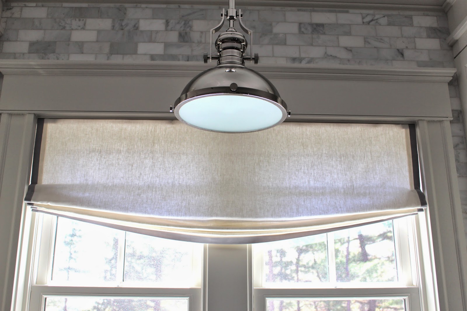
this shade over the kitchen sink ended up a bit longer than i wanted but i didn't think it was worth sending back.
(again, weirdo marble)
i used etsy seller ideal window fashions (same one who did the shade in charlie's bedroom) and overall the workmanship is fantastic - very well made and the ribbon is placed impeccably. i gave grace, the owner, a description and my inspiration shots and she nailed it. they all have that slightly relaxed look which to me is the perfect balance between too formal and too casual. and all of the width measurements fit the windows to a tee which is important when you're doing inside mounts.

one way that i saved money was asking for these to be non-operational. we would never put them up and down so it saved a ton on fabric and mechanics to make them a fixed length. also i asked for standard lining (vs blackout) since it's the kitchen/family rooms and i don't mind - in fact i prefer - if light filters through.

(i must have taken this shot 100 times and this is the brightest i was able to get it - pathetic!)
at first my hubby declared that he hated them (sweet) but then his eye got used to it and i think he likes them now. it's such an important point though - you get really used to looking at something the way it is that sometimes when you change it, you actually think you've made a mistake. but my experience is to give it time and usually (except for things like our laundry, oops), you end up happy.


No comments:
Post a Comment